I enjoyed this class more than I thought I would. I think of web designers as artists. I have never considered myself as an artist. So I wasn't sure how I would do or what I would get from the course. What I ended up getting is a deep appreciation for design. Although I thank the Professor for that, I also thank all of my classmates. It was both motivational and inspirational to discuss the course and its theories
and to see and admire your work. I am proud to be among you and can't wait for our next adventure together.

Saturday, December 17, 2011
closing thoughts
It was great this past semester working with everyone. I have learned a great deal regarding how web sites are constructed. I now have a good understanding of form and function and how each component works together. Learning about the various font styles and how those styles started. Taking a look at the balance and symmetry of a web site design. Having a understanding of color. What colors will work well together, which colors won't works as well together. The meaning of each colors etc. One of the assignments I did like was comparing magazine vs. web.
I also learned how to work with Photoshop which I have never worked with before this semester. I would like to wish everyone best of luck and to have a nice holiday.
Dave Kalkanoff
module 8 recap.


Thursday, December 15, 2011
@ the end of our semester
As we get closer and closer to the end of this class I can't help but think of all of the useful information that we exchanged throughout the semester. I found myself using the information that we learned in my day to day work life (great feeling)!
I was wondering if this blog and all of the class material will be available after the class is over? I was also curious to know if anyone would be willing to share the projects that they worked on throughout the class with each other. I am more than willing to share the pieces that I've worked on. Feel free to contact me via my personal email asaunders678@gmail.com or via twitter @asaunders678 anytime! Thanks for all the great knowledge share and conversation in this class.
I was wondering if this blog and all of the class material will be available after the class is over? I was also curious to know if anyone would be willing to share the projects that they worked on throughout the class with each other. I am more than willing to share the pieces that I've worked on. Feel free to contact me via my personal email asaunders678@gmail.com or via twitter @asaunders678 anytime! Thanks for all the great knowledge share and conversation in this class.
Friday, December 9, 2011
Minute Maid Article
I found this article on Brand Packaging and found it very interesting to see the process of how designers created the Minute Maid look. Through design and research designers choose a look that was appealing to new customers as well as existing customers.
This article is a great over view of what happens doing package design and how companies look at past and future consumers in the designing process.
http://www.brandpackaging.com/Articles/Brand_New/BNP_GUID_9-5-2006_A_10000000000000714143
This article is a great over view of what happens doing package design and how companies look at past and future consumers in the designing process.
http://www.brandpackaging.com/Articles/Brand_New/BNP_GUID_9-5-2006_A_10000000000000714143
Monday, December 5, 2011
Red or Blue, Get Your Flavorpill To Order

Print magazines which have already long established their reputation as such, National Geographic, GQ, Electronic Gaming Monthly, for example, in creating their online editions quite possibly made their run through several laborious content strategy meetings, style guides and design iterations to a greater degree than more recent, perhaps web 2.0-born, online-only magazines. The former have the added task of presenting their content consistent with their established brand but with all the new responsive and interactive methods of delivering that brand content online, and some have managed this quite well, while the latter have the benefit of launching with all the bells and whistles built right into their brand and delivery.
Flavorpill is one such example wherein we find not only a magazine native to the internet, but also one that offers a broad range of topics in contemporary culture; books, film, design, art and multimedia—and Flavorpill has quite intelligently designed their workflow to utilize web 2.0 communication tools, like social media, to stay up-to-the-minute on these topics, where a print journal would have to balance their print editorial structure with what is published online; one good example is Wired and its web edition. Flavorpill manages this format in several specific cities in the United States, and London.
Of course, digital natives are not (yet) born in and of their own connections online. In other words, their design and implementation still follows conventions we find in "meat space"; namely, letters to the editors and writers, in the form of comments, which are now frequently published in print versions of some magazines, like Wired; readers can subscribe to online-only magazines, typically for free and receive a newsletter-style email, the body for which is a condensed version of the brand style seen on the website, with the most visited and newest content linked; and, of course, use of images. However, these aspects mentioned, while they are analogues of print magazine layout and delivery, have been adjusted to the scaling potential of user-generated, feedback, and responsive, interactive behaviors online. Real-time affects have brought forth, by default, a new dimension of feedback, appropriation and re-delivery—and print magazines have a good deal of pressure to balance the inherent need to stay present, and current, with the time it takes to compile, editorialize, layout, design and print a monthly magazine.
Meanwhile, online publications like Flavorpill are freer to experiment, without the anchor of inverting or struggling to keep alive an established print magazine.
Sunday, December 4, 2011
ravasquez-module7-screencast_national-geographic
Saying a word or two about the print and web editions of the most recent National Geographic.
Salon.com- Heather Kick
I think on-line publications have a huge advantage to print publications. Their information can be more timely, linkable, share-able, etc. Not only that, but layouts, color schemes, menus can all carry over from page to page. Being an internet based publication, space and materials are no longer an issue. However, just because you have the capability to be bigger and better than a print publication, doesn't always mean you are. With an almost overbearing amount of information, data management can become an issue. Salon.com, in my opinion could easily be swallowed whole by the information found on their page.
The top of their home page is nice. There is a main story and several other top stories highlighted. Then, there is a line with the title "Recent Stories". Below that is just a huge list of stories. This format reminds me of an "above the fold" format. The design is much sleeker, much more welcoming, much more enjoyable to read "above the fold." But below that, it's like the website didn't know what to do. Salon.com has tried to carry over the print design a bit too much. I think it is time that they throw these concepts away and learn what functionality they can really utilize. Once they learn how to better manage the information, then they can put more thought into the form.
As is, there isn't much to be said for the form. There aren't that many colors used. It's strictly set to black, white and red. The articles are written in a serif font. Even the layout is lacking "below the fold". Even "above the fold" there is a bit of awkward spacing with layout...

I don't think Salon.com has really even started to utilize the format of their delivery. And that's a shame.
Slate Gets It Right
I read Slate all of the time and have always loved the design of the front page. It is set up to scan for stories quickly with the most important stories at the top. Then, of you have time you can scan for more lifestyle stories and analysis that might interest you.

Slate is an example of an online Newspaper that gets it. I think they do a better job online that sites with a paper and ink counterpart. It seems difficult for the editors of those companion sites to break away from the paper into the digital world. The front page is where that is most important, for that is you menu of option. It is the entire reason online is better than news print - you don't need to search through a paper to find stories that interest you, they are all right there for you to chose.
Compare Slate to the New York Times site.

The Times insists on laying out their web site much like their print edition. The copy under the headlines eliminates choices. The Times offers eight stories in the space you see above. With a changing image, a scroll and several menus, Slate offered five times more options in the same space.
I think the biggest difference in design approach between newspaper sites with a print counterpart and those without is the front page. The sites without a paper and ink mother don't have to struggle with the separation anxiety that seems to keep the companion sites from breaking away from what was to what can be. Those at companion sites have an ingrained and antiquated idea of what a newspaper should look like. I have friends who have worked at newspaper web sites and have expressed frustration with the inability of those who come from print to be able to see past the paper in their hands.
That is not to say designers should forget the past completely. In fact, it is important that they do not. Slate doesn't. Once you are past the front page, things start to look a lot more conventional.

Headline, sub-heading, picture, one column, traditional type, spacing and paragraph breaks - it's all right out of the old newspaper. This layout is easy to read, comfortable to the readership and promotes a sense of credibility that has been built by a hundred thousand articles laid out the same exact way in a thousand newspapers.
It's important to keep some of what was, especially on a news site where lay out is a symbol of journalistic standards. Its just not important on the front page.

Slate is an example of an online Newspaper that gets it. I think they do a better job online that sites with a paper and ink counterpart. It seems difficult for the editors of those companion sites to break away from the paper into the digital world. The front page is where that is most important, for that is you menu of option. It is the entire reason online is better than news print - you don't need to search through a paper to find stories that interest you, they are all right there for you to chose.
Compare Slate to the New York Times site.
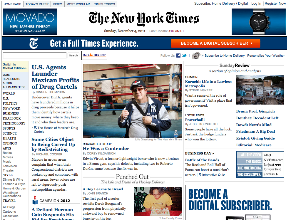
The Times insists on laying out their web site much like their print edition. The copy under the headlines eliminates choices. The Times offers eight stories in the space you see above. With a changing image, a scroll and several menus, Slate offered five times more options in the same space.
I think the biggest difference in design approach between newspaper sites with a print counterpart and those without is the front page. The sites without a paper and ink mother don't have to struggle with the separation anxiety that seems to keep the companion sites from breaking away from what was to what can be. Those at companion sites have an ingrained and antiquated idea of what a newspaper should look like. I have friends who have worked at newspaper web sites and have expressed frustration with the inability of those who come from print to be able to see past the paper in their hands.
That is not to say designers should forget the past completely. In fact, it is important that they do not. Slate doesn't. Once you are past the front page, things start to look a lot more conventional.

Headline, sub-heading, picture, one column, traditional type, spacing and paragraph breaks - it's all right out of the old newspaper. This layout is easy to read, comfortable to the readership and promotes a sense of credibility that has been built by a hundred thousand articles laid out the same exact way in a thousand newspapers.
It's important to keep some of what was, especially on a news site where lay out is a symbol of journalistic standards. Its just not important on the front page.
Screencast
After several horrible attempts at recording myself (and trying to fit into 5 minutes), here is my presentation.
http://www.screencast.com/t/yNCNjWcG9a
http://www.screencast.com/t/yNCNjWcG9a
People is Popular
I just wasn't sure what people would think if I tried to buy Seventeen Seventeen :)
Here is my presentation.
The interesting thing about People Magazine online and in Print is that they rarely share content. In fact, they have two distinct jobs under the same umbrella. The Print version is for interviews and articles with celebrities and interesting people. The print version prides itself on being 50% celebrity and 50% human interest (although I am not sure that's true.) The online site is purely celebrity news and is updated several times daily.
Slate vs. The World
I went surfing around the Slate website to see how different the site would be from that of popular print magazine websites. I expected that there would be a pretty noticeable difference in the structure and design of the website. What I found was it was essentially the same website as tons of other news websites. Upon arriving at the Slate home page, I immediately thought of the GQ homepage.


Both websites seem to be a cluttered mess that is differentiated not by its design, but by the quality of its content and columnists. While magazine's like People, GQ, and Car and Driver can afford to keep a cluttered homepage with an overload of information, Slate does not have this luxury because the website is the only source that people can go to in order to get information from Slate. This causes a conundrum because people will often want to play it safe as to not lose visitors to the site, but I personally would suggest making the website feel more like a magazine, since that is what it is supposed to be.
I think designers should take risks - particularly those that are designing for situations as unique as digital-only magazines. I would personally offer an option on a Slate splash page in which users get a "normal HTML-like, cluttered page or they can choose a more magazine-like style so that laptop users or even mobile web users have the option to flip through the website like a magazine. Psychologically, this could give readers a magazine feel and make them believe that they are getting an amazing deal because they are getting quality magazine-like information for free. Slate has an opportunity to be better than the rest of the magazine world. I think they're missing out.
People Magazine (Screencast)
Here's the link to my screencast comparing the on-line and print versions of People Magazine.
http://screencast.com/t/qcznuiBOtP4
http://screencast.com/t/qcznuiBOtP4
Saturday, December 3, 2011
BAK Magazine
The online magazine I decided to go with was BAK Magazine. I actually stumbled upon this accidentally, but I was really glad I did. The design of this magazine is really impressive; vivid colors, eye-catching artwork and some interesting articles. Here is a cover shot of Issue 14:

The design approach of this "cover" is similar to that of any print magazine--an attractive graphic, the magazine name and information about the articles inside. The next page offers a letter from the editor, the layout being just like a print magazine,
 Something you will notice on this page as well is that this magazine is bilingual--English and Turkish. I'm sure about anyone else, but this is the first time I have come across this and I am a bit impressed with this unconventional approach.
As you browse through the rest of the magazine there are plenty of impressive graphics and great articles and interviews. The articles/interviews design and layout are quite similar to what it would look like if it did have a print counterpart.
 The design approach in BAK is very different from, for example, the digital version of National Geographic. With National Geographic, most of the design detail and attention is given to the print version. In the print you find larger photos, a variety of color and a variety of font. With the online version, you find a fraction of the design effort. In BAK, since this is the only version, all design effort is put into the digital version. I'm not sure that BAK is really taking away any 'conventions' from the print magazine genre. It keeps the same design format as a regular print, but gives it a bit more edge and creativity. I think more designers should go this route and print magazines could take a lesson on how to make their digital counterparts more interesting and exciting.

The design approach of this "cover" is similar to that of any print magazine--an attractive graphic, the magazine name and information about the articles inside. The next page offers a letter from the editor, the layout being just like a print magazine,

As you browse through the rest of the magazine there are plenty of impressive graphics and great articles and interviews. The articles/interviews design and layout are quite similar to what it would look like if it did have a print counterpart.

Slate magazine IPAD vs. print magazine
I decided to take a look at Slate magazine on my IPAD. It has a very nice layout. I like at the top of the page you have contents, the slatest (instead of latest) video, and podcast. The contents tab is closely related to the table of contents in a print magazine. The slatest tab gives you recent stories with a headline and the first few sentences of the article. The page on the site also has pictures for each article on the right. It's easier for you to look at all the recent stories at one time instead of flipping pages in a magazine. The video tab has recent videos of stories from the past week. Not only can you read articles on this site, but you can also watch videos. The final tab is podcast. When you click on podcast you have podcast categories to choose from, the topics are as follows. 1) Daily Podcast, Political Gabfest, Culture Gabfest, Hang Up and Listen, Double X, Audio Book Club, Spoiler Specials, The Root, Manners for the Digital Age, Poetry.
Comparing Slate magazine to a print magazine. Most print magazine you see on the shelves have a great deal of pictures. The pictures they have are very eye opening. I can see that there are more advertisements in a print magazine. A lot of people complain that printed magazine have too many advertisements. The only advertisement on the Slate site is Liberty Mutual. There are several places to go within the contents of Slate or a printed magazine. The differences I see is that there are more articles, you can interact by reading the blogs, there is a slide show. Down at the bottom of the page you are able to post articles on Facebook or Twitter, Instapaper and email. You are unable to use any of these interactive tools with a printed magazine. These are some of the conventions that take away from printed magazines. Yes, it is necessary to have an online magazine that has video, podcasts, blogging, and interaction amongst several social networking sites. These thing are going to make more and more people want to turn to a non printed magazine. As far as design for Slate magazine I don't know what more they can do right know. Maybe in the future we will be interacting even more by communicating instead of typing words. The design of a magazine, however needs to find a way that is totally different than all the printed magazines out there currently. There will be a time where printed magazines will become obsolete. There won't be a need for them everyone will have some type of interface with you allow for you to get your magazines electronically.
Online magazine Observation
I had a difficult time finding a magazine on the web that did not have a print counterpart so I chose to evaluate http://www.alistapart.com/ (one of the examples given in the module description).
This website is set up very similar to a blog. It it is very easy to read and navigate through and the colors are neutral but perfect for the web. The 3 column set up makes the homepage easy to read and the large text in the navigation bar makes it easy to find your way around the site. It is nice that you can click on all names of authors and article titles to learn more. Interaction is key when building an online magazine. Another feature that I thought helped organize the site is the ability to search through topics. The site is calm and is not confusing or cluttered at all. Overall, this site looks very professional and well made.
This website is set up very similar to a blog. It it is very easy to read and navigate through and the colors are neutral but perfect for the web. The 3 column set up makes the homepage easy to read and the large text in the navigation bar makes it easy to find your way around the site. It is nice that you can click on all names of authors and article titles to learn more. Interaction is key when building an online magazine. Another feature that I thought helped organize the site is the ability to search through topics. The site is calm and is not confusing or cluttered at all. Overall, this site looks very professional and well made.
Salon.com magazine or newspaper?
Salon.com is an online liberal magazine. It focuses on delivering USA politics and reviews and articles on music, film, and books. This online magazine is designed in a tabloid layout. This magazine is consistent with its layout throughout the whole website. When visiting this website, you feel as if you are on a news website instead of a magazine’s website. Salon.com online magazine lacks pictures and is solely driven by its story.
When I think of a magazine I think of fascinating layouts and amazing ways of placing images. I think of dimensional pages and the usage of lots of colors. However, this magazine lacks colors, large pictures, and enjoyable layouts. I dislike how lengthy the threads are on this website. They don’t utilize links to navigate through different web pages; they just place them all on one page.
Online magazines do take away from the feeling of buying a magazine on a stand. Simply by removing a lot of the ads you lose a chunk of the excitement you had when opening a magazine. I remember buying Glamour magazine just to see what new fragrance and bags were available for the season. I don’t visit online magazine for this purpose anymore. When I visit a magazine online I am just interested in the images and brief articles.
Salon.com is almost identical to visiting a news website. For this, I believe that there should be something implemented for magazine websites to stay consistent with their “magazine feel” layout.
Rue
Rue magazine
This magazine can be viewed on your screen or through an ipad app. Rue has articles about fashion, food and interior design. The overall on-line magazine layout is similar to a print magazine such as real simple. Both magazines are clean with an open layout that has plenty of white space.
The Rue magazine website is less cluttered. The website acts as the shell for the digital magazine and to point out certain topics. I enjoy flipping through the magazine pages as if it were a print piece. Being able to click on topics I like to automatically go to that website is very convenient. Having the magazine in digital format on-line the designers can focus on the information in the magazine and then focus on the information on-line separately.
When I visit realsimple.com I notice that all the articles I’ve seen/read in the print version are on the homepage. On ruemag.com I can go onto the site view the magazine and then view other topics the designers have pulled out and placed on the website. It allows all the information from the magazine and additional information to site nicely on a website with out over whelming the site with information.
The interior of the rue magazine is very similar to a print magazine however it appears to have less on each page. Since this magazine fits on an ipad designers probably had that in mind as to how much content can fit on an ipad screen. The font is mostly san-serif, which is easier to read on-line.
Overall this magazine captures some similarities to actual print magazines however conforms them nicely to an on-line only publication. Similar to printed magazines the pages of the digital magazine are set up in certain groups of topics- fashion, interior design, going out, etc. It has created a nice open space for viewers to read the magazine and additional information with out repeating information on two platforms.
Friday, December 2, 2011
Digital Vs. Print
One site I go to frequently is Engadget. I consider it a digital magazine because of the content it offers. Engadget is full of technology stories, podcasts, reviews, an online store and galleries. Instead of flipping through pages, you are just scrolling on down with the bulk of the content on the left side, and ads on the right side. Content wise, it feels and looks like a magazine with text and pictures.
A publication that is on paper and is digitized both contain similar content, but delivery is where it is different. With print, there is more opportunity to showcase photography and creativity using imaging and color. On the web, the text is mostly black on white, with pictures floating around it. Design wise, a lot of web publications have a "blog feel" to them. You see the headline, followed by an introductory paragraph, and then you choose if you want to continue reading or just skip it. It's a cookie-cutter mold for each story thereafter.
In print, the story is there. It's hitting you in the face. Once you turn the page, chances are you'll bypass the entire story and head into the next one. But it's limited. Once all pages are occupied, there is no more room to accommodate breaking news or updated information on a story. It must wait until the next publication. With web magazines, it is very easy to update a story or add a new one on the fly. Space isn't an issue.
But again, that's where creativity plays a key role. Given set parameters, constructing a solid piece of work within the constraints of a page could be a challenge, but the presentation could be amazing. It's almost like each page is its own web page. In the end, I don't mind the simplicity of the layout of most online publications, but I really do feel that more creativity goes into print because each page is unique in design.
Car and Driver (magazine vs. internet)
https://capture.quinnipiac.edu/recordings/djkalkanoff/Car%20and%20Driver%2050212/Car_and_Driver_50212_-_Flash_(Large)_-_20111202_03.23.38PM.html
Zite: iPad Digital Magazine
Zite is a customized online digital magazine for the iPad. Once the application is first downloaded a screen pops up to choose topics you wish to read about and keep updated with. These topics will be saved and every time you open the Zite magazine articles will be pulled from different sources based on the topics of your choice.
I don't see to much of a difference in design approach between Zite and an online magazine that has a print counterpart such as People Magazine. Both online versions are packing in as more information and content as possible. The idea behind the online versions seems to be more of getting the information across rather than flashy. The big difference is that a site such as Zite is pulling articles from several sources rather than having writers of their own.
The only other non-convential design to this magazine is that you are picking the information you want to read. Of course in a print magazine you can skip over those stories but this magazine is specifically designed to only bring to you what you wish to know. I think this is a fantastic idea for producers. Finding the information you want with out the extra "garbage" has never seemed to easy. I think designers should attempt to bring new ground and bring in new ideas to magazines.
Screencast
Here is a link to my screencast of People Magazine.
http://www.screencast.com/users/smcoppola/folders/Default/media/fc0e2cec-c5f1-4508-9bc6-e101eb86ca6f
Monday, November 28, 2011
Coloring The World Through Media
After reading article after article on color and the psychology of it, I found myself really enjoying the infoplease.com page detailing the meaning of colors - particularly when it comes to fashion, but in my research I stumbled upon an article looking at the symbolism in the movie Pleasantville and what the contrast of black and white against color meant. The movie had a real interesting take on looking at race relations and used color to simulate the segregation of the 1950's and 1960's well. Going even further, the movie decided that when a character would have some type of pleasure (usually sexual pleasure) or enlightening and growth experience, they would change from being portrayed in black and white to then being seen in color. It was a very interesting way to look at the evolution of society as it grows and learns new things: changing from a monochrome and boring black and white to an exciting and colorful new being.


It was really interesting seeing how influential color can be not only in the clothes we wear, but the houses we live in, the rooms in which we work and learn, the websites we view, and even the movies and television shows we watch.


It was really interesting seeing how influential color can be not only in the clothes we wear, but the houses we live in, the rooms in which we work and learn, the websites we view, and even the movies and television shows we watch.
Color and the World
After writing and researching color and its physiological meaning, I now understand the importance that color has in our every day life and in web design. Color is vital to set a mood and feeling on a website. Knowing your audience can help you identify what colors to use on a web site. Different people can interpret colors in many ways so knowing your audience plays a strong role on developing an effective site.
This reading motivated me to continue to search the meaning of colors and its physiological impact around the world. Very interesting.
Sunday, November 27, 2011
The Confinement of Color Theory
I will make a bold admission that I did not enjoy the required reading as much as the rest of you, with the exception of one essay - The Red Queen Color Theory by Bob Stein. I wanted to cheer as he told web designers everywhere that they need not be constrained by color theory, color wheels and color surveys. As he gave designers permission to use their skills and artistry to lead public perception of color rather than follow, he was also giving me permission to take with a grain of salt everything else I read.
I then went in search of examples in support of The Red Queen. I found the ammunition I needed at Tiffany's and the pre-K Montessori class that my daughter teaches.
Tiffany's and Co. picked an unusual color over a century ago that was called Robin Egg Blue. The color is now commonly called Tiffany Blue and is copyrighted by the jewelry company. It was not the obvious choice in the late 1800s, but it was the right choice. Instead of the designer being led by the Psychology of Color, he or she blazed a new trail and in doing so, changed the psychology. Tiffany Blue now stirs emotions of romance, quality and elegance.

Pink is the favorite color of two year old boy's in my daughter's pre-K class. But it is not the favorite color of the 3 and 4 year old boys. She has witnessed this phenomena over the past six years. As they grow, they learn an aversion for pink from their parents and their peers. It is not innate, it was pushed for marketing purposes by Department stores in the early 1900's. Before that time, most department stores sold pink clothing as the dominant color for boys.
Here is a chart from a 1927 Time Magazine showing what color the major department stores in the country were selling as the dominant color for boys and girls.

So if something as so deeply ingrained in our psyche as "pink is for girls and blue is for boys" can be changed. It is proof that marketing and design, when done right, can change the psychology of color. So Bob Stein and the Red Queen are right. The designer should not be led by color theory based on the prevalent psychology of the day. A powerful design can change that philosophy.
The designer should not be led. He or she should lead. He or she should be The Red Queen and create the next Tiffany blue.
Global Color
Like everyone else, I really enjoyed the reading and assignments this week. My favorite being the history of color throughout the world; the different cultural meanings and how they have changed over the years. And how the meanings vary from culture to culture! In Asia, for example, orange is seen as a positive, spiritually enlightening color, while here in the US we associate it with road signs indicating hazards, traffic delays and inconvenience.
I did take one of the color psychology quizzes, and the results were a bit mixed. While it was on target for a few ("Creative and emotional, looking for ways to further expand those qualities.Seeking adventure and new and unusual activities."), other results weren't quite as accurate ("He is being forced to put happiness and pleasure on hold due to his limiting circumstances.").
I did take one of the color psychology quizzes, and the results were a bit mixed. While it was on target for a few ("Creative and emotional, looking for ways to further expand those qualities.Seeking adventure and new and unusual activities."), other results weren't quite as accurate ("He is being forced to put happiness and pleasure on hold due to his limiting circumstances.").
Psychology of Color


As I was typing this I was watching NBC. Everyone should know what NBC logo has been the past 55 years. That's right the peacock! John J. Graham created the peacock in 1956. Several other animals were thought of even the butterfly. NBC choose the peacock because people knew what it meant to be "proud as a peacock". NBC wanted to let people know that new programs were going to air in color. In order to help promote NBC's television programming what better way to promote through a colorful peacock. Here's a link below that will tell you the whole story.
http://www.big13.net/NBC%20Peacock/NBCPeacock1.htm
So Many Colors. So Many Wonders.
Learning how humans interact with colors on a daily basis, all around the world, really opened my eyes. Even though as a society we can associate a specific emotion to a color, everyone's reaction and experience is going to be different. I've searched the internet for various readings and research done on this topic, and a lot offered much more than I expected.
I have to admit that the first link I opened to start preparing myself for this assignment was the "Colour Assignment" study. It went through the experimental process of gathering data, presenting it and delving into the science behind colors. It gave me a really good representation of color across the metrics of gender, age and language. The graphs easily depicted the data and conveyed the messages within.
What I learned from this assignment was that there is more to just knowing red, blue and green. The colors within, the colors that are formed and the way we interact with them on a daily basis is what matters. The psychology of color association and perception can be explained much more in detail than my 3,000 word essay. I've only touched the surface and dived a bit into the studies. From what I learned is that from society to society, our understanding of what color is, changes. Knowing how to adapt color into everyday design, and knowing the emotion it will produce is crucial in designing a solid piece of work.
A wave of light is powerful than we can ever imagine. Learning how to work with it is the real goal.
The meaning of package colors at the grocery store
During my reading for how the human response to color is used in design I came across this article http://www.chow.com/food-news/81044/the-food-package-color-secret-decoder/
Along with our other reading on what colors mean, this article was a bit more specific with some colors and why they are chosen. I found the fact that red and blue play off of each other so well and that like Pepsi and Coco Cola competitors will choose colors based on what their competitors colors are.
In the Color Psychology article by David Johnson, I found it really interesting that blue was not a top food package color for him. He said "While blue is one of the most popular colors it is one of the least appetizing." When I was at the grocery store I looked around and was alarmed at how many blue packages covered the shelves. I think when the blue is used correctly it is not offensive or implies the food is bad. Also I think the color of blue chosen makes or breaks the consumers emotions on the package.
Overall I enjoyed learning about the means of colors, specially outside of the United States. It is important to have an understanding of the color scheme your market will get the most positive attention from.
Saturday, November 26, 2011
Psychology of Color- Heather Kick
The selection of reading were a great portrayal of how differing the ideas and reactions of color truly are. And it's not just about personal opinion, but about upbringing, cultural influences, and perception. The first reading, "Color Assignment," showed the results of color surveys contradicting the conclusions of Birren's color psychology studies. And in the "What Color Means" article you can see that depending on your culture different colors could mean mourning, courage, or jealousy.
Beyond the symbolism, cultural influences on the perception of color come from the history of that color. A fantastic book on that very history is Color: A Natural History of the Palette by Victoria Finlay. I read this about a year ago. It really makes you appreciate color in a raw way.
There is certainly a lot to be said about color. It can bring emotion in to any visual. Even the lack of color can mean something. What makes this truly artistic is that the effect can mean different things to different people. Being aware of this, you may be able to create a new influence of your work depending on the color palette as designed for different groups.
Regardless, color should not be overlooked or under estimated in your design.
Wednesday, November 23, 2011
Color Discussion
I throughly enjoyed all of the readings on color. I often found myself reading something that reminded me of why a friend chooses the colors he or she does, which resulted in me having to text them to let them know.
The reading that stuck with me the most was the "What Color Means." It is incredible how much the meaning of a color changes when moving through different cultures and different countries. I think what shocked me the most is that black is not the universal color for mourning. For example, the color of mourning in South Africa is red. We grow up with such large influences on how we perceive color it is sometimes hard to comprehend that others don't view the colors in the same way.
I also enjoyed reading how we associate colors with certain things. For example, blue is the symbol of love which is why a bride wears something blue on her wedding day. All the meanings of phrases with colors in them begin to make sense! Colors have been fun to explore and learn the meaning of.
Tuesday, November 22, 2011
Color Scheme Designer
I came across this Color Scheme Designer and thought you guys might like having a few clicks with it, and could possibly find it useful.
Monday, November 21, 2011
First Grade on Steroids
While reading through our assignment on Color last week, I couldn't help but think about finger painting - mixing colors to make new ones, experimenting with different shades, adding white to lighten colors, etc. This thought was triggered specifically by the sections we read about color wheels. Color wheels are something that we've all grown up with. We're taught from an early age that primary colors are red, blue and yellow...and then next come secondary colors, and so on.
One thing that I never thought while learning my colors in elementary school, was how important they really are. I thought he most interesting section of reading was focused on the meaning of each color across cultures (thinking that yellow can stimulate metabolism did make me laugh though - only because there is a lot of yellow in my house). Throughout the reading, I realized how important color is to all aspects of design - architectural, web-design, fashion to name a few.
Adding color to the display type assignment was also fun and eye opening. I personally, edited my originals by adding color to see the difference between the 1st and 2nd batches. It was incredible that an addition of color could change the emotion that came from looking at each piece so dramatically. For example; adding a very light gray background and changing font color to light pink can truly evoke the sense of a whisper.
Sunday, November 20, 2011
Balance and Symmetry Example
This example, from Bob Hagh, jumped out at me as having very solid, unambiguous decisions about which types of layouts are in each website.
https://docs.google.com/open?id=0B9rASny4nCbjOWM2ZjM3YjQtODI0Mi00ZThmLWIyNzctMWIzNWZmMzA2ZGFm
https://docs.google.com/open?id=0B9rASny4nCbjOWM2ZjM3YjQtODI0Mi00ZThmLWIyNzctMWIzNWZmMzA2ZGFm


New site tracks "terrible mobile web design"
On a side note, I have not used Blogger in over a year, and I must say it's become a far richer experience even in that short time; a bit like Tumblr (low-calorie Wordpress). I might start a new blog(ger) just to use to more Googley interface. Anyway, to that end here's another article that raises topics we've discussed in class, this one from Wired and has some nice linkage too.
Saturday, November 19, 2011
module 5 thoughts on color
It's interesting to learn about Primary color, Second colors, Tertiary colors. etc. How some colors work better with other colors. There doesn't seem to be that much difference in a printer's color wheel vs. a painter color wheel. It looks like it has to do with the brightness of the color or chroma. Colors that compliment each other are at there best when they are fully saturated. Red and green is opposite of each other if you put them together graphically it doesn't look that good because of the brightness of the colors together. There is more light when viewing on a computer. Color saturation is very important to know in order to gain the right blend of colors. Whenever you are putting together a site. You will want to use colors that will be appealing to your eyes. You will not want to use anything that will be to bright.

In T.V. production before any event or show that goes on the air we have to check color bars so the program has the correct video levels. The colors displayed on color bars are; magenta, cyan, red, green, blue, and yellow. In order to get the proper video levels we use equipment called the waveform monitor and vector scope. Both the waveform monitor and vector scope help with the brightness or luminance of the video. Does anyone know of any tools/equipment you can use when creating a site to help with color. I know you can read online at various site to find out what will work for color and what won't. I was wondering if there is anything out there similar to a validator when checking for HTML errors on your site, but for color only.
Subscribe to:
Comments (Atom)