

Slate is an example of an online Newspaper that gets it. I think they do a better job online that sites with a paper and ink counterpart. It seems difficult for the editors of those companion sites to break away from the paper into the digital world. The front page is where that is most important, for that is you menu of option. It is the entire reason online is better than news print - you don't need to search through a paper to find stories that interest you, they are all right there for you to chose.
Compare Slate to the New York Times site.
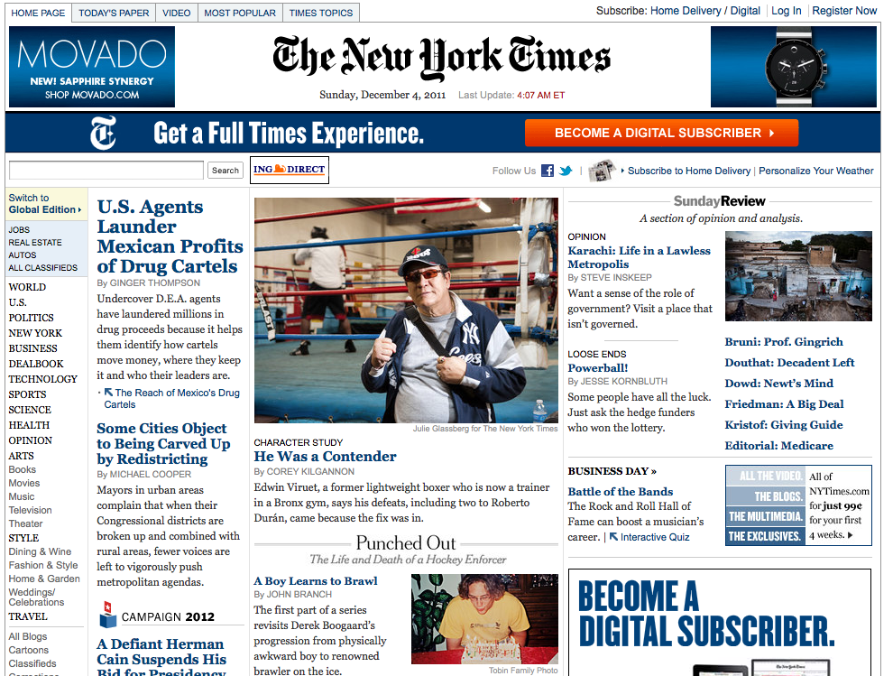
The Times insists on laying out their web site much like their print edition. The copy under the headlines eliminates choices. The Times offers eight stories in the space you see above. With a changing image, a scroll and several menus, Slate offered five times more options in the same space.
I think the biggest difference in design approach between newspaper sites with a print counterpart and those without is the front page. The sites without a paper and ink mother don't have to struggle with the separation anxiety that seems to keep the companion sites from breaking away from what was to what can be. Those at companion sites have an ingrained and antiquated idea of what a newspaper should look like. I have friends who have worked at newspaper web sites and have expressed frustration with the inability of those who come from print to be able to see past the paper in their hands.
That is not to say designers should forget the past completely. In fact, it is important that they do not. Slate doesn't. Once you are past the front page, things start to look a lot more conventional.

Headline, sub-heading, picture, one column, traditional type, spacing and paragraph breaks - it's all right out of the old newspaper. This layout is easy to read, comfortable to the readership and promotes a sense of credibility that has been built by a hundred thousand articles laid out the same exact way in a thousand newspapers.
It's important to keep some of what was, especially on a news site where lay out is a symbol of journalistic standards. Its just not important on the front page.
I love the visual comparisons that you added!
ReplyDelete